A dashboard is not measured by how many metrics it shows, it is measured by how many decisions it changed. Most marketing dashboards fail that test: opened weekly, looked at, closed, and nothing happens. This piece is about what turns a dashboard from a reporting screen into a decision tool: which metrics are genuinely leading indicators, where the data that platform dashboards cannot see lives, and which part of reporting should be automated.
1. A dashboard’s job is to trigger decisions, not to report
There is a practical test: count the decisions you made because of this dashboard in the last three months. If the answer is zero, the problem is not the quality of the data, it is the design of the dashboard.
- Every metric needs an owner. A number nobody owns makes nobody do anything, it just occupies screen space.
- Every metric needs a threshold. “Conversion rate 2.1%” is not information on its own. “Below target and falling for three weeks” is.
- Every threshold needs an action. If what to do when it is crossed was not written down in advance, that threshold is an observation, not an alert.
2. Rarely watched metrics that warn you first
Traffic, session duration and return on ad spend matter for campaign health, and all of them look backwards. The ones below surface a problem earlier.
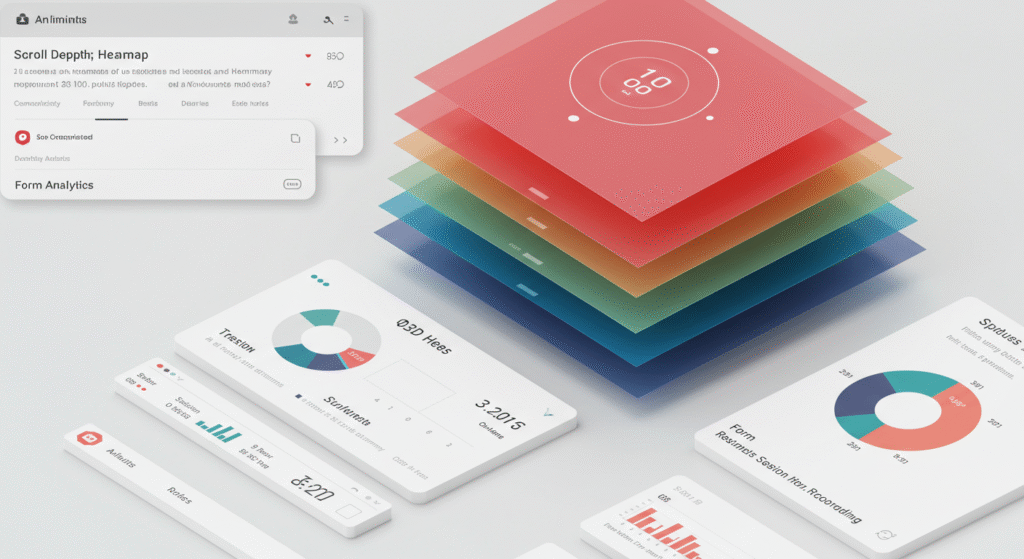
- Scroll depth: how far down the page people actually get. On a landing page it is the honest measure of whether the page held anyone.
- Engaged session rate: the fastest read on whether the traffic you bought was interested. If return on ad spend looks good while this is low, the number will not survive the next budget change.
- Product views per add to basket: shows whether the category page is surfacing the right product.
- Rate of site searches with no results: evidence of both a range gap and a naming mismatch, and both are actionable.
- Time to first repeat purchase: the leading indicator for retention. It degrades weeks before monthly revenue does.
3. The data platform dashboards cannot see
The dashboards that ship with analytics and ad tools answer the questions you knew to ask. The answers to the ones you did not ask live elsewhere.
- Heatmaps: where attention actually goes on the page, which is rarely where the layout assumed.
- Session recordings: the source everyone avoids because watching them is slow. It is also the only place the reason for a basket abandonment can be observed rather than inferred.
- Form analytics: who starts the form, which field they stop at, and how many seconds each one costs them.
- Post-order data: return rate, delivery time, support tickets. Almost never present in a marketing dashboard, and the thing that actually tells you which product to scale.
Leaving these in three separate tools means nobody opens them. The right approach is to land them all in one model: from the sources into a warehouse, from there into a single semantic model, with the dashboards built on top of it. That is what makes the word “conversion” mean the same thing on every screen.
4. Build alerts, do not watch screens
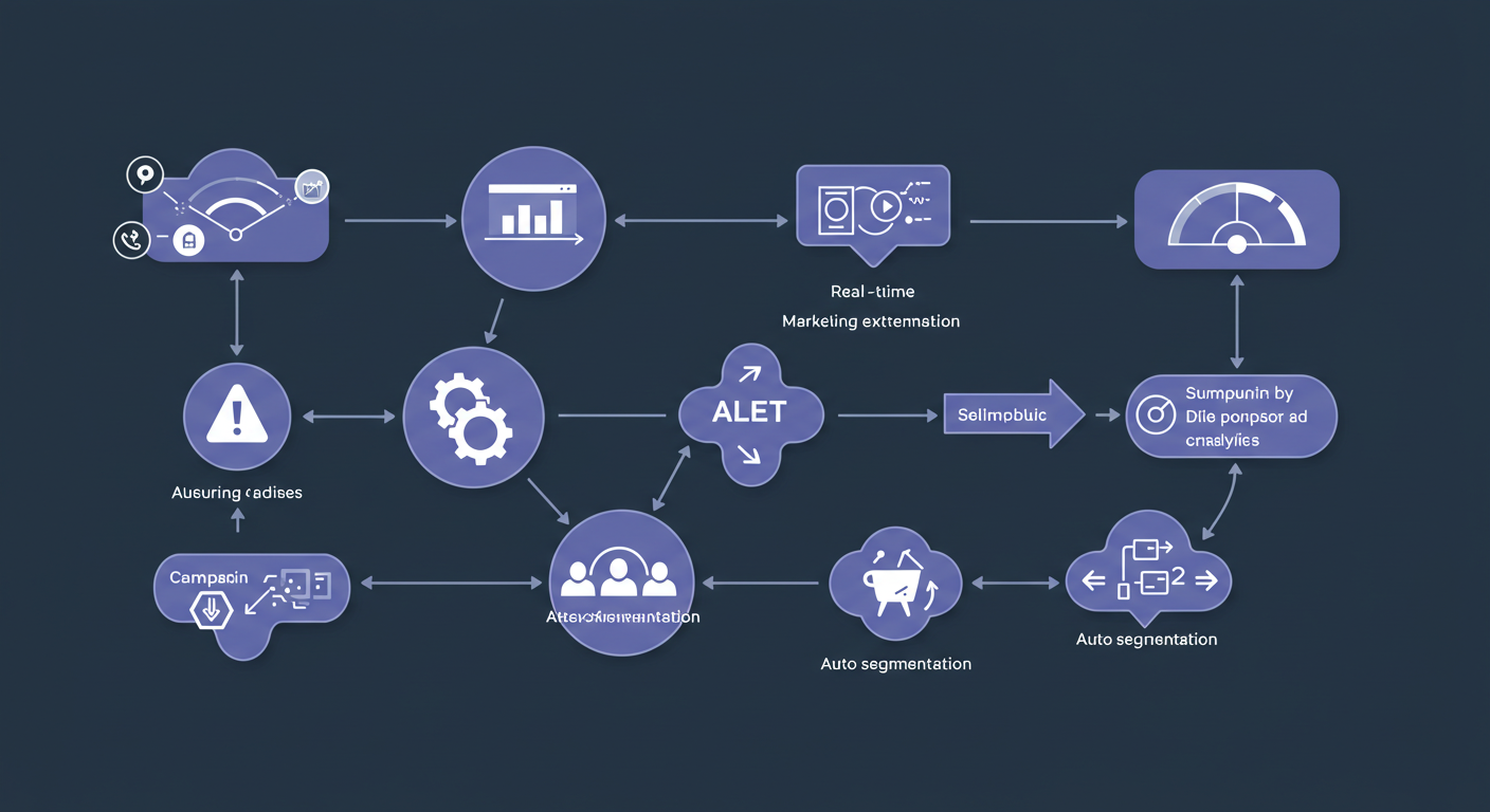
The moment a metric matters is the moment nobody is looking at the dashboard. So the work is done by the alerts you set, not by the dashboard itself.
- Breakage alerts: something should arrive when conversion rate drops below a threshold, or when measurement goes silent altogether. The second happens more often and is noticed far later.
- Data quality alerts: when the gap between order count and platform conversions passes a set percentage. This is the real cause behind most problems that get mistaken for a drop in performance.
- Opportunity alerts: when a product starts selling above expectation. Seeing that in the weekly report is already too late for a stock decision.
- Send the alert where the person is. An alert lost in an inbox counts as not built.
5. A dashboard is a design problem
Dashboards are usually built by the data side and used by the marketing and sales side. So the design has to serve a decision rather than an eye.
- One visual per metric. Two views of the same number is where the confusion starts.
- It has to work on a phone. Most of the people deciding something from this report will open it on one.
- Colour should carry meaning. A metric moving the wrong way should be visible without reading the number.
- Always show the comparison period. A number without context is a number nobody can call good or bad.
6. Automate the reporting
A report assembled by hand every week costs an afternoon and carries an error rate. Automated, it can be read both live and backwards.
- Land the analytics and ad platform data in one place instead of reconciling three exports by hand.
- Automate a closing report per campaign: which audience, which creative, which budget, and what came of it.
- Collect every A/B test result in one table, so the next decision is made from the last ten rather than from memory.
- Put segmentation inside the model. An RFM-style segmentation computed in the model carries the same definition on every dashboard.
7. In e-commerce, feed health is a dashboard too
The data that almost never appears on a marketing dashboard, and that gives the earliest warning in e-commerce, is the product data itself. Sometimes the reason a category’s sales fell is not the campaign, it is that the products in that category were disapproved.
What makes this data leading is the timing. A disapproved product loses its impressions first, then its clicks, and only last its sales. So by the time a dip shows up in the revenue chart the problem usually started a fortnight earlier, and those two weeks were visible on the feed side from the beginning. The same relationship runs the other way: a category whose missing fields get filled in gains visibility without anything changing in the campaign.
Three numbers belong on the dashboard: the disapproval count, the share of products missing a required field, and the catalog’s overall grade. Feed analysis produces all three with more than 30 checks per product and grades the catalog A to F, which is what makes this data readable on the same screen as everything else.
Frequently asked questions
Which tool should I start with?
The choice of tool matters far less than the model underneath it. Looker Studio, Power BI and the rest give the same answer from the same data. What decides the outcome is whether your metric definitions live in one place. Scattered across dashboards, two of them will eventually answer the same question differently.
How many metrics should I track?
As many as you can act on. In practice five to seven read weekly is the ceiling for one team. Beyond that is the most reliable way to produce a screen nobody opens.
Is GA4 enough on its own?
It is a good source of behavioural data, and on its own it knows neither your margin, nor your return rate, nor your ad cost. Decisions need all three, so GA4 is an input to a model rather than the model itself.
If you need a team that builds the data pipeline and the dashboards together, that is what our analytics side does. If your current reporting is not making anyone do anything, let us take a look.

Pingback: Cohort analysis in Power BI - Verintra Digital